Nutrition
Optimizer
Nutrition Optimizer is a mobile app prototype I created in Figma that turns personalized nutrient targets, a weekly budget, and local grocery prices into an optimized whole-food shopping plan. This was my final project in the UW UX & Visual Interface Design program. It combines UX strategy, interface design, illustration, and motion.
Explore the Figma prototypeThe Problem
People want to eat healthy, but understanding nutrition, planning meals, and staying within budget can feel overwhelming.
Interview participants described three recurring problems: understanding nutrition, planning meals, and staying within budget.
“I don’t know what my nutritional needs are. Currently, I’m just guessing.”

The Solution
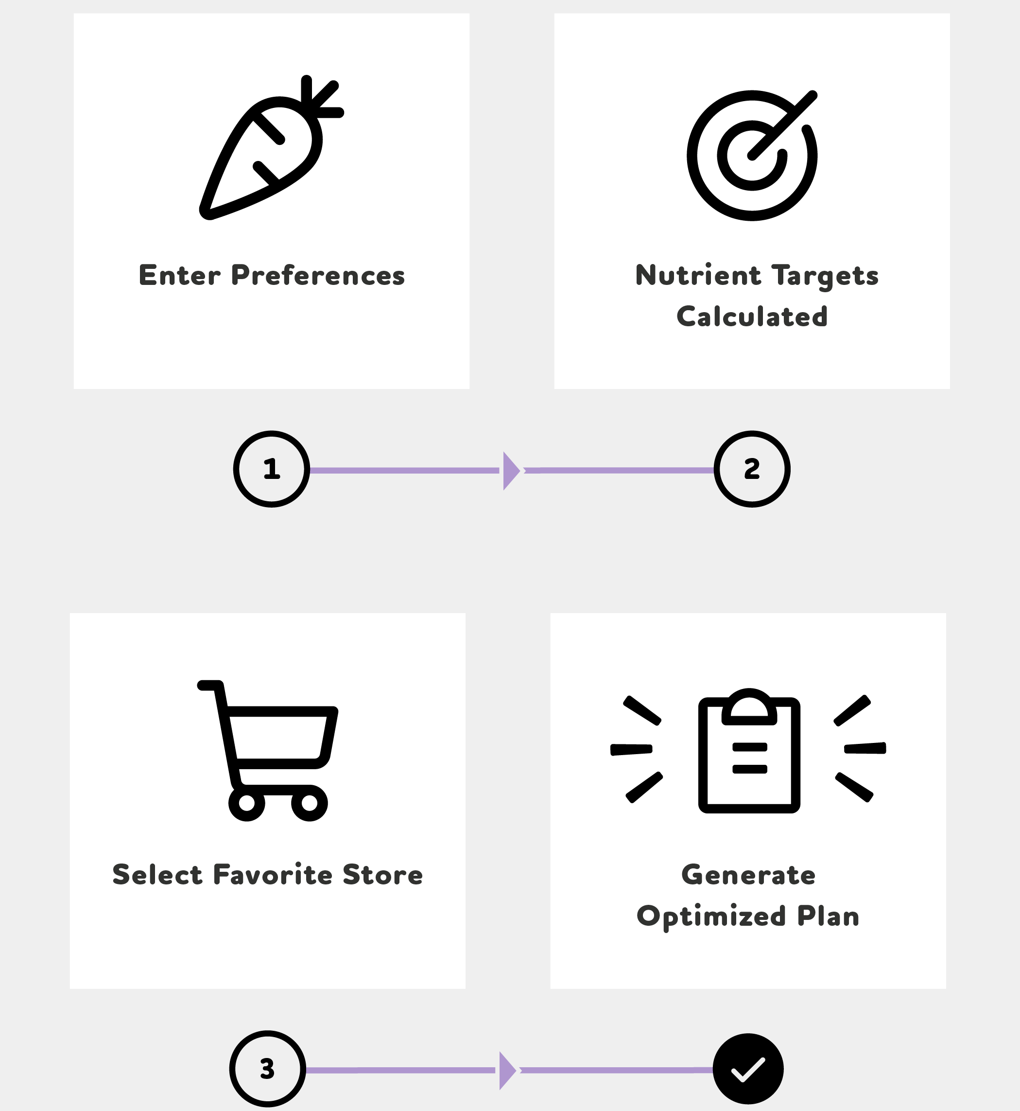
Nutrition Optimizer combines dietary preferences, personal nutrient targets, a weekly budget, and selected local stores to create the cheapest plan for meeting the user’s nutrient goals.
“What should I buy to eat better without spending a fortune?”
UX Strategy
The app needs personal information before it can provide useful recommendations. The primary UX problem was helping users complete that setup without making onboarding feel like paperwork.
To accomplish this we targeted four goals.
Reduce Effort
One decision per screen. Simple, focused layouts.
Build Confidence
Positive reinforcement. Immediate feedback.
Provide Guidance
Persistent progress indicator. Contextual help.
Maintain Momentum
Smooth screen transitions. Consistent layouts.
Lo-Fi Prototype
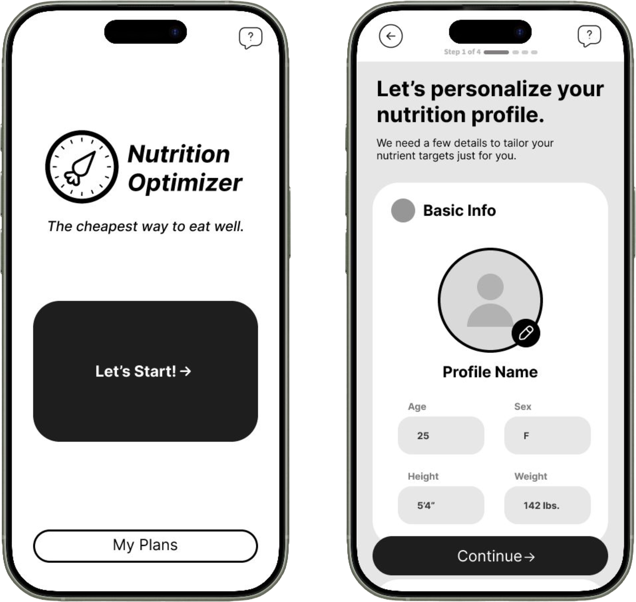
The low-fidelity prototype was simple and spacious, with no branding or color, so user testing could focus on structure and flow.
Testing revealed that onboarding required too much scrolling. The process felt endless because users could not easily tell where they were or how much remained.
I revised the flow to use one section per screen and a much more prominent progress indicator.
Design Strategy
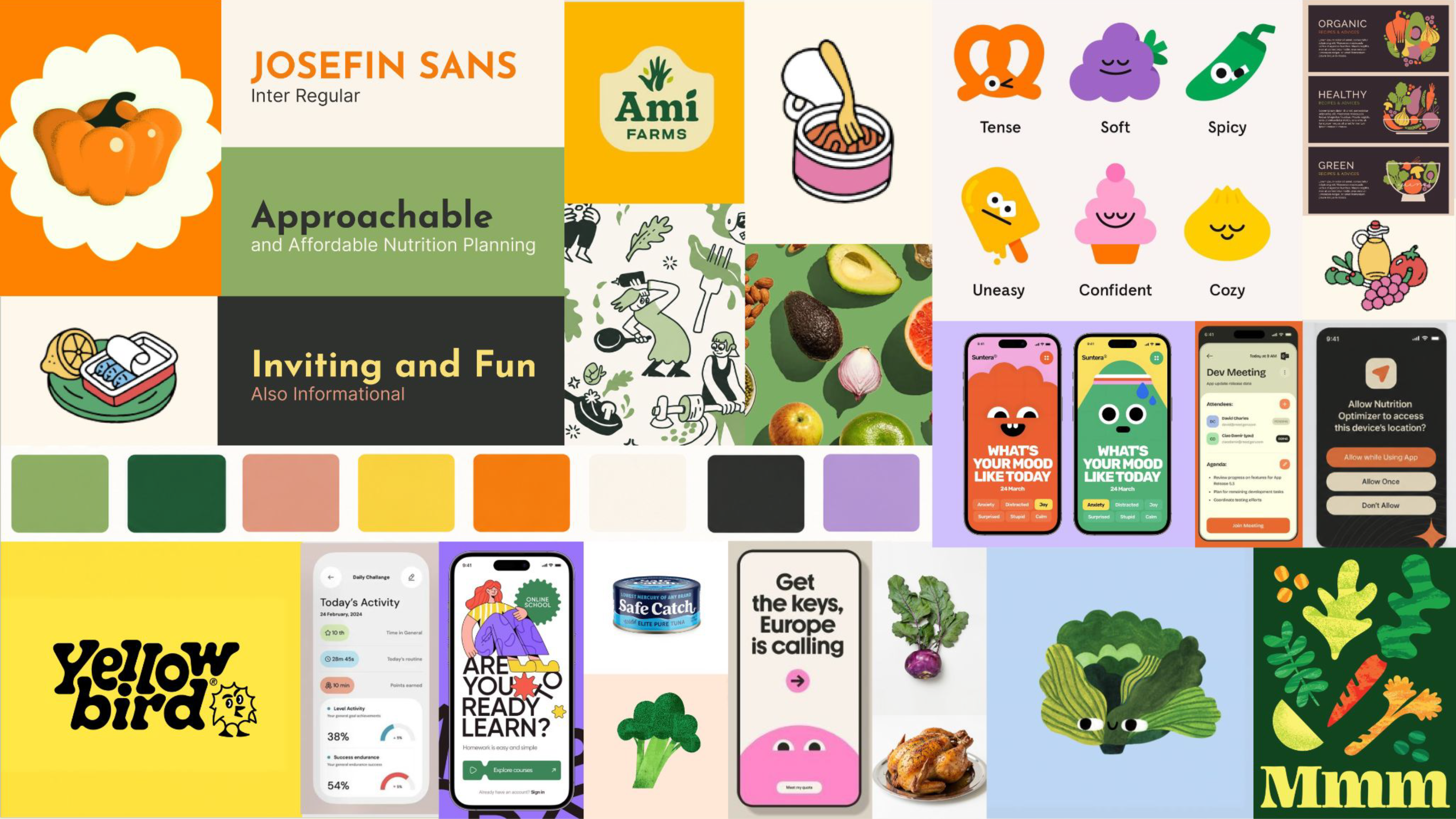
The design strategy reinforces the UX strategy through visual hierarchy, color and personality, consistency, and simplicity.
Spacious layouts, large typography, a warm palette, playful illustration, and reusable components make the experience feel approachable rather than serious or clinical.
Onboarding Design
Onboarding was the point where the UX and visual design needed to work together most closely.
One section per screen and a persistent progress indicator make the process easier to understand. Animated success screens provide encouragement and a brief pause, while screen transitions reinforce forward momentum.
The header fades instead of sliding so the user isn’t distracted by trying to read large moving text.
Optimized Plan
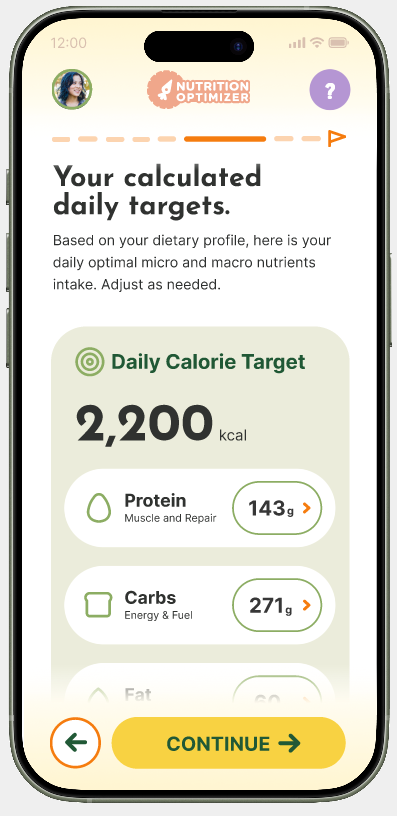
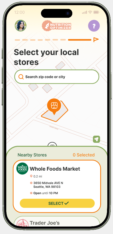
After onboarding, the app generates personal nutrient and calorie targets. Users can edit those targets, set a budget and timeframe, and select one or multiple local stores.
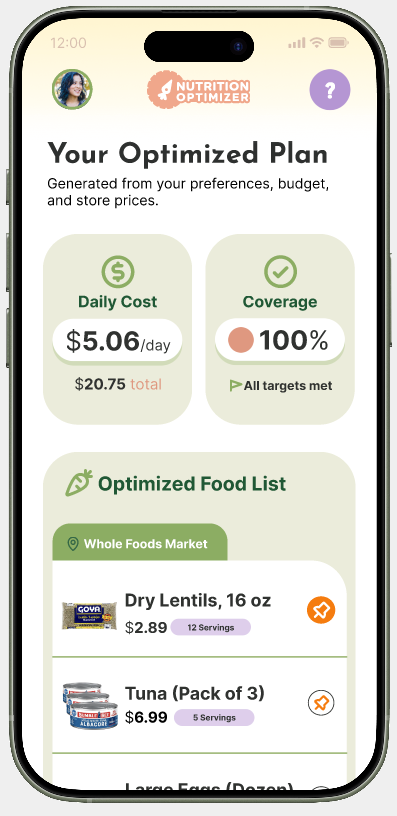
The optimized plan shows daily cost, nutrient coverage, and a food list organized by store.
It is not a static meal plan. Users can adjust it around their budget, preferences, stores, and ingredients they already have.
Plan adjustments include:
- Replace or remove foods
- Pin preferred items before recalculating
- Explore recipes using plan ingredients
- Account for pantry items
- Adjust the budget
- Export a grocery list
Reflection
Research shaped both the product and the interaction design. User frustration with effort and uncertainty led to a more guided onboarding structure, while the need for approachability informed the visual style.
This project showed me how small interaction decisions can make a significant difference in how a product feels.
Next steps would include more usability testing around onboarding completion and engagement, along with building the remaining user flows into the prototype.
Nutrition Optimizer makes eating well feel less like a stressful guessing game and more like something people can afford and act on.